Posts in Category: Art Tutor
Viridian in Landscape Painting: Artists Who Used This Important Green Pigment
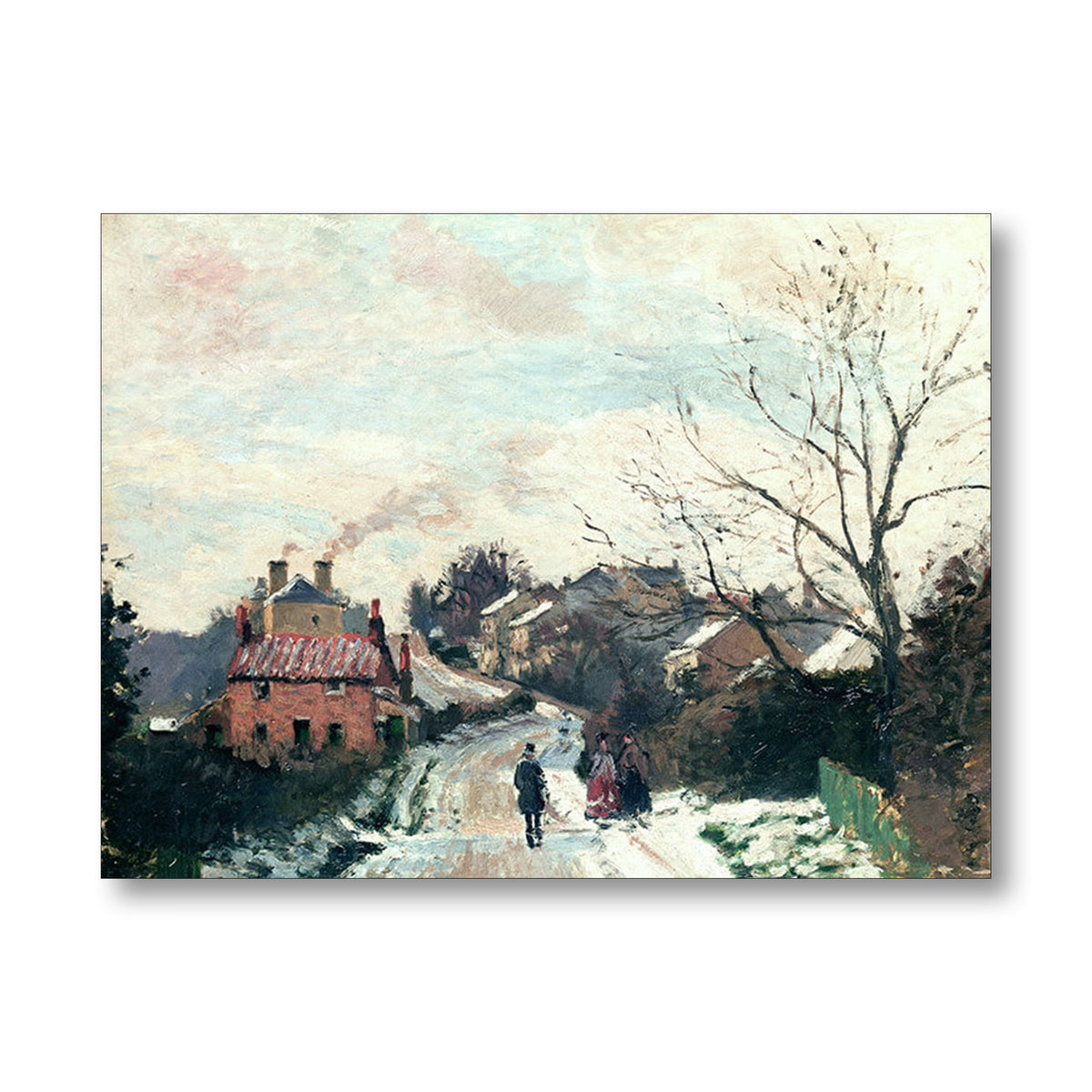
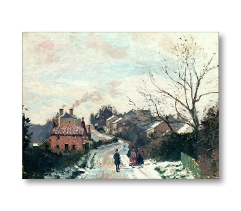
Featured Image: Camille Pissarro, Fox Hill, Upper Norwood, 1870, oil on canvas, National Gallery, London. Pigment analysis has identified Viridian in the green fence, mixed with other pigments.
Viridian was an important pigment in the development of landscape painting because it changed what painters could do with green.
Viridian gave landscape painters a permanent, cool, transparent green that could be used to create both vivid and naturalistic greens. Unlike many earlier greens, it was more stable, more versatile and safer than poisonous pigments such as Emerald Green. Its bluish undertone made it especially valuable for painting foliage, distance, cool shadow, reflected light and atmospheric landscape effects.
Before Viridian, many green pigments were either dull, unstable, poisonous, difficult to control, or visually harsh. Viridian offered artists a strong, cool, bluish-green that was more reliable and useful for serious painting. It is hydrated chromium oxide, usually identified today as PG18. ColourLex describes it as a vivid green with a bluish tint, while Winsor & Newton describes it as an intense bluish-green that can be mixed with yellow, orange or red to create a wide range of natural greens.
For landscape painters, this mattered enormously. Green is one of the hardest colours to manage in landscape painting. Straight-from-the-tube greens can look artificial, acidic or decorative. Viridian is powerful, but because it is transparent or semi-transparent and cool in temperature, it can be modified into many more natural landscape greens. Mixed with yellow, it can create fresh foliage greens; mixed with earth colours, it can become subdued and natural; mixed with red, orange or burnt sienna, it can be neutralised into greys, shadow greens and atmospheric darks.
It was also historically important because it provided a safer alternative to earlier poisonous greens such as Emerald Green, which contained arsenic. Winsor & Newton notes that Viridian was produced in Paris in the nineteenth century as a replacement for hazardous Emerald Green.
Viridian was important because it offered painters a cool, bluish, transparent green that was more stable and far safer than arsenic-based greens such as Emerald Green. It was also more luminous and versatile than duller pigments such as Chromium Oxide Green. For landscape painters, this meant they could mix fresher foliage greens, cooler shadows, atmospheric distance and more subtle natural greens without relying on unstable or highly poisonous earlier pigments.
Its transparency is another reason painters value it. Viridian can be used in glazes, thin passages, cool shadows and optical mixtures. This makes it particularly useful for painting distance, reflected light, foliage, water, shadowed grass and atmospheric recession. It is not just a “green”; it is a way of controlling temperature, depth and luminosity in a painting.
Artists Who Used Viridian
Viridian became part of the modern nineteenth-century palette used by Impressionist and Post-Impressionist painters. Artists such as Pissarro, Monet, Cézanne and Van Gogh used modern synthetic pigments to break away from the darker, earthier palettes of earlier academic painting. Viridian helped make possible a brighter, more light-filled approach to landscape. Viridian Green, PG18, is found in Impressionist and Post-Impressionist painting and remains popular today.
The strongest examples of artists who used Viridian in landscape painting are Turner, Corot, Pissarro, Monet, Cézanne, and Van Gogh. These artists are particularly of note because their use of green was not merely descriptive. Viridian allowed them to explore atmosphere, optical vibration, reflected light, cool shadow, distance and the living structure of the landscape.
J. M. W. Turner
J. M. W. Turner was one of the great experimental colourists of English painting. He is known to have used new synthetic pigments as they became available, and Viridian appears among the pigments associated with his later practice. Turner’s interest in luminous atmospheric effects makes his use of modern greens particularly significant for landscape painters.
Jean-Baptiste-Camille Corot
Corot is an important figure in the development of nineteenth-century landscape painting, standing between the classical landscape tradition and the more broken, naturalistic handling that would influence the Impressionists. Technical research and museum discussion of Corot’s materials indicate the possible or identified use of Viridian in his landscape work.
Camille Pissarro
Camille Pissarro is one of the clearest examples of an Impressionist landscape painter known to have used Viridian. Pigment analysis of works such as Fox Hill, Upper Norwood has identified Viridian among his materials. This is especially relevant because Pissarro’s landscapes often depend on subtle modulations of green, grey, blue and earth colour rather than a simple local green.
Claude Monet
Claude Monet made extensive use of modern nineteenth-century pigments, and Viridian was part of the expanded colour range available to the Impressionists. In his landscapes, garden paintings and water-lily subjects, green was not treated as a flat descriptive colour but as a shifting optical field, affected by light, atmosphere, reflection and surrounding colour.
Paul Cézanne
Paul Cézanne is known to have used Viridian in landscape paintings, including Provençal subjects. His use of green is particularly interesting because he did not simply imitate natural appearances. Instead, he built landscape through structured colour relationships, using greens, blues, ochres and earth colours to create form, rhythm and spatial weight.
Vincent van Gogh
Vincent van Gogh used Viridian in some of his landscape paintings, including works where greens are mixed with other strong pigments such as chrome yellow, emerald green and white. His use of green was often expressive rather than purely naturalistic, helping to intensify the emotional force of the landscape.
Alfred Sisley
Alfred Sisley, like the other Impressionists, worked within the new nineteenth-century palette made possible by modern synthetic pigments. Viridian is associated with Impressionist landscape practice, although any claim about Sisley should ideally be tied to a specific technical analysis of an individual painting. His landscapes are useful to study because of their cool, silvery greens and atmospheric handling.
Édouard Manet
Édouard Manet was not primarily a landscape painter in the same sense as Monet, Pissarro or Sisley, but he painted outdoor subjects and garden scenes and made use of modern nineteenth-century pigments. Where Viridian is discussed in relation to Manet, it is best treated as part of the wider modern palette of the period rather than as a defining feature of his landscape practice.
Berthe Morisot
Berthe Morisot’s outdoor scenes and garden subjects belong to the same modern painting context in which Viridian became important. As with Sisley and Manet, her work is highly relevant to the broader discussion of modern greens, broken colour and Impressionist light.
Earlier Green Pigments
A list of earlier green pigments that were used before Viridian became widely available.
Green Earth / Terre Verte
Green Earth, also known as Terre Verte, is one of the oldest green pigments used by painters. It is a natural earth pigment, usually soft, muted and grey-green rather than bright. It was useful for underpainting, flesh tones, shadows and subdued landscape greens, but it lacked the intensity needed for brilliant foliage or strong modern landscape colour.
Malachite
Malachite is a natural copper carbonate mineral pigment. It was used from antiquity and through the medieval and Renaissance periods. It can produce a beautiful green, but it is relatively coarse, expensive, variable in colour and not as strong or flexible as later synthetic greens.
Verdigris
Verdigris is a copper-based green made from the corrosion of copper. It was widely used historically and could produce a bright bluish green, but it was chemically unstable and could darken or change over time. This made it problematic for permanent painting.
Sap Green
Sap Green was originally a lake pigment made from plant material, especially buckthorn berries. It was used as a transparent green, useful for glazing and botanical effects, but traditional Sap Green was not very permanent. Modern Sap Greens are usually mixtures rather than the original plant-based pigment.
Green Verditer
Green Verditer is an artificial copper carbonate pigment. It was used as a blue-green pigment, but it was not as durable or versatile as later greens. It belongs to the older group of copper-based greens that were gradually displaced by more reliable nineteenth-century pigments.
Scheele’s Green
Scheele’s Green was developed in the late eighteenth century and became popular because it was much brighter than many earlier greens. However, it contained arsenic and was highly poisonous. It was used not only in artists’ materials but also in wallpapers, fabrics and decorative objects, which made it notorious for its toxicity.
Emerald Green / Paris Green / Schweinfurt Green
Emerald Green, also known as Paris Green or Schweinfurt Green, was introduced in the early nineteenth century. It was one of the most brilliant greens available to artists before Viridian, but it was also arsenic-based and extremely toxic. It was valued for its vivid colour but was dangerous to manufacture, handle and use.
Chromium Oxide Green
Chromium Oxide Green was introduced before Viridian and was more stable and less toxic than the arsenic greens. However, it is a dull, opaque, earthy green. It is useful in painting, but it does not have Viridian’s clarity, transparency or bluish luminosity.
Cobalt Green
Cobalt Green was another nineteenth-century green available before Viridian became widely used. It was more stable than the arsenic greens, but it was often weak in tinting strength and expensive. Its colour could also be rather subdued compared with Viridian.
Landscape Painters and Viridian: Why PG18 Matters in Oil Painting
After writing about the change in the Winsor & Newton Artists’ Oil Colour range from traditional Viridian to Viridian Hue, I wanted to look more closely at why Viridian matters in landscape painting.
This is not just a technical question about pigment codes. It is a question about the behaviour of green in painting.
Green is one of the most difficult colour families for landscape painters to control. It can so easily become too bright, too acidic, too decorative, or too illustrative. A good landscape green often has to be broken, softened, greyed, cooled, warmed, or pushed backwards to create a subtle atmosphere. That is where genuine Viridian, made with PG18, becomes important.
In my previous post, I wrote about my disappointment at discovering that the current Winsor & Newton Artists’ Oil Colour Viridian Hue is no longer the same as my old Winsor & Newton Artists’ Oil Colour Viridian 692, AA, Series 4, which I had kept since art school. Winsor & Newton’s current Artists’ Oil Colour Viridian Hue is listed as pigment code PG26 and PG7, not PG18. PG7 is phthalo green, a much stronger and more assertive pigment.
For a landscape painter, that change matters.
What is Viridian?
Viridian is a cool, bluish green pigment. Its pigment code is PG18. Chemically, it is hydrated chromium oxide.
Viridian was first prepared in Paris by Pannetier around 1838, and later patented by the French chemist Guignet in 1859. Because of that, it has also been known historically as Guignet’s Green.
It arrived at an important moment in European painting. The nineteenth century transformed the artist’s palette. New synthetic pigments gave artists colours that were brighter, more stable, more varied, and more reliable than many of the older materials. Viridian belonged to this new world of colour.
Before Viridian, many green pigments were problematic. Some were dull. Some were unstable. Some were poisonous. Emerald green, for example, was vivid but arsenic-based. Viridian offered a more stable, transparent, cool green that could be used in oil, watercolour, and other media.
For landscape painters, this was significant. Viridian was not merely a tube green. It was a modern green that could be used to explore light, air, water, foliage, distance, and shadow.
Why Viridian became important to landscape painters
Viridian is particularly useful in landscape because it is not a loud, opaque, yellowish green. It is cool, transparent to semi-transparent, and slightly blue in character. Viridian Green PG18 is a semi-transparent green pigment with a distinctive blue undertone, found in the paintings of the Impressionists and Post-Impressionists.
That blue undertone is important.
In landscape painting, greens are rarely simple. The green of a nearby leaf is different from the green of a distant tree. The green of grass in sunlight is different from the green of a shadowed bank. The green of a tree against the sky is different from the green reflected in water.
Viridian helps because it can be modified. It can be warmed with yellows, ochres, and earths. It can be neutralised with reds and crimsons. It can be cooled with blues. It can be pushed into greys, blue-greens, sea-greens, and atmospheric shadow colours.
This is why genuine PG18 Viridian is so different from a phthalo-based Viridian Hue. A phthalo green mixture may look similar from the tube, but it often has a much stronger tinting strength. It can take over a mixture very quickly. That may be useful in some kinds of painting, but it is not always helpful in naturalistic landscape painting, where subtle control is everything.
Viridian and the Impressionists
Viridian became closely associated with the Impressionists and Post-Impressionists. This is not surprising because their work depended on outdoor observation, broken colour, optical vibration, and a much more direct engagement with modern pigments.
The Impressionists were not simply painting “green fields”. They were painting the effect of light on green. They were painting air, weather, reflection, distance, and changing conditions.
A pigment like Viridian gave them a cool green that could be used in mixtures and contrasts. It could be set against warmer colours, and it could assist in building the optical complexity of foliage, water, and shadow.
Viridian’s importance is not that every Impressionist used it in exactly the same way. Its importance is that it belonged to the modern palette that made this new approach to landscape possible.
Claude Monet and modern green
Claude Monet is one of the painters most closely associated with the modern landscape palette. His work depends on the relationship between colour, light, water, reflection, and atmosphere.
Viridian belongs naturally to this world. A cool, transparent green is useful in painting water, reflected trees, shadowed banks, and the cooler notes in foliage. Viridian and chromium oxide greens entered painting at a time when plein-air landscape painting was becoming increasingly important.
Monet’s use of greens was never simply descriptive. He was not just filling in trees or grass. He was building a colour structure. In that kind of painting, a green pigment has to be capable of subtle relationships. It has to work with blues, violets, yellows, reds, and earth colours. It has to sit within the whole atmospheric key of the painting.
That is why genuine Viridian is so useful. It is not merely bright. It is adjustable.
Van Gogh and Viridian
Vincent van Gogh also used Viridian. In his case, the pigment becomes part of a more expressive and structural use of colour.
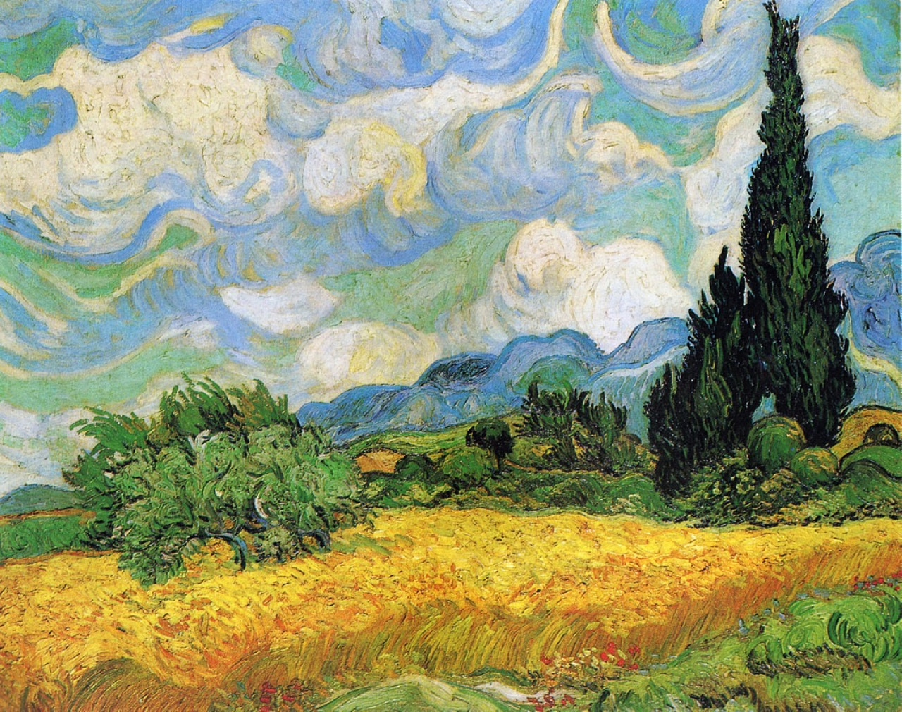
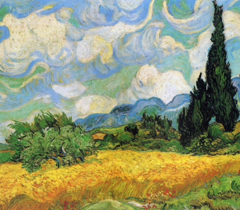
Viridian can be identified in Van Gogh’s A Wheatfield with Cypresses. In one area of the painting, the pale green bush below the blue mountain is described as containing Viridian, chrome yellow, and zinc white. Other green passages contain mixtures involving emerald green, hydrated chromium oxide green, zinc white, and chrome yellow.
That example is useful because Van Gogh was not using green timidly. He was using modern pigments to create force, rhythm, heat, structure, and emotion. The National Gallery describes A Wheatfield, with Cypresses as one of several versions Van Gogh painted in 1889 while he was at Saint-Rémy.
Viridian, in Van Gogh’s hands, is not merely naturalistic. It becomes part of a heightened landscape language. It can contribute to the intensity of the painting while still retaining its cool, bluish character.
This shows one of the great strengths of Viridian. It can be used subtly, but it can also be used expressively. It is not a weak pigment. It is a controlled pigment.
Viridian and the problem of distant trees
One of the reasons I became interested in Viridian again was because I am now working with landscape after twenty years of working almost entirely in charcoal. In charcoal, tone, edge, pressure, and atmosphere are everything. Returning to oil paint, I am very aware that colour can easily become too literal, which is particularly true when painting trees in the distance.
Distant trees are not usually bright local green. They are affected by air, light, moisture, and distance. They often need to be cooler, greyer, softer, and less saturated than the trees in the foreground. A strong phthalo-based green can easily come forward. It can sit on the surface of the painting rather than receding into space.
Genuine PG18 Viridian is useful because it can be persuaded into distance. Mixed with earthy reds and ochres, it can produce broken greens that feel more natural and less artificial. It can help create a green that belongs to the landscape rather than sitting on top of it.
That is why I think the move from PG18 to PG26 and PG7 in the Winsor & Newton Artists’ Oil Colour Viridian Hue is a real issue for landscape painters because it changes the way the colour behaves.
Why PG18 is different from PG7 in practice
PG18 Viridian is generally quieter, cooler, more transparent, and more subtle. It has a restrained tinting strength. It can be used in glazes and in delicate mixtures. It is very useful when a painter wants natural greens without garishness.
PG7, phthalo green, is a very different pigment. It is powerful, staining, highly tinting, and intensely chromatic. It is an excellent pigment in its own right, but it does not behave like traditional Viridian.
The problem with a Viridian Hue containing PG7 is not that it is unusable. The problem is that it is not a direct replacement. It may look close enough in a colour chart, but it will not necessarily mix like PG18 on the palette or behave like PG18 in a painting.
For serious painters, pigment behaviour matters more than colour name.
English landscape painting and restrained green
As someone particularly interested in English landscape painting, I think this question of restraint is important.
English landscape painting has often depended on subtle tonal and atmospheric relationships. Whether one is thinking about Constable’s broken naturalism, Turner’s atmosphere and light, the tonal restraint of later landscape traditions, or the painterly handling of twentieth-century British landscape painters, green is rarely just green.
The English landscape is full of muted colour: damp fields, grey skies, winter hedges, blue-green distance, dark tree masses, chalk paths, wet leaves, and low light. A landscape painter needs greens that can be moderated.
Viridian is useful because it can help produce these cooler, quieter notes. It is especially valuable when mixed away from its full chromatic strength. It can be taken into greys, soft blue-greens, shadow greens, and atmospheric mixtures.
This is the opposite of the crude “grass green” problem that ruins so many amateur landscapes. The aim is not to find the brightest green. The aim is to find the right green in relation to the whole painting.
Why I am replacing my old Winsor & Newton Viridian with Rembrandt 616
My old Winsor & Newton Artists’ Oil Colour Viridian 692 is now something I will use sparingly. It appears to belong to the older PG18 formulation. The current Winsor & Newton Artists’ Oil Colour Viridian Hue 696 is listed as PG26 and PG7.
That makes me reluctant to buy it as a replacement.
Instead, I am going to try Rembrandt Oil Colour Viridian 616. Royal Talens lists Rembrandt Viridian 616 as PG18, semi-transparent, with its highest lightfastness rating. It also appears to be one of the best-value genuine PG18 Viridian paints currently available in a large tube.
For my purposes, that makes sense. I want a genuine Viridian for landscape painting: a cool, transparent, restrained green that can be used in mixtures, glazes, distant trees, shadowed foliage, and atmospheric passages.
I do not want a phthalo-based approximation when the whole point is subtlety.
Other artist-quality PG18 Viridian options
For artists looking for genuine Viridian, the key is to check the pigment code. Do not rely only on the colour name. Look for PG18. Some artist-quality oil paint manufacturers that produce or have produced genuine PG18 Viridian include:
Rembrandt Oil Colour Viridian 616
Gamblin Artist Oil Viridian
Jackson’s Professional Oil Viridian Green
Michael Harding Viridian
Old Holland Viridian Green Deep
Williamsburg Viridian
Holbein Viridian
M. Graham Viridian
Blockx Viridian
Lefranc Bourgeois Viridian
Maimeri Viridian
Cranfield Viridian Green
Rublev/Natural Pigments Viridian
Availability changes, so I would always check the current pigment information before buying. Paint names are not enough. The pigment code is the important part.
Conclusion: Viridian is not just a green
Viridian has a serious place in the history of landscape painting. It belongs to the nineteenth-century expansion of the artist’s palette, to the rise of modern plein-air painting, and to the colour language of Impressionist and Post-Impressionist landscape.
It is useful because it is subtle. It is cool, transparent, bluish, and capable of being modified into natural greens. It can help a landscape painter avoid crude, illustrative colour.
That is why the change from traditional PG18 Viridian to a PG26 and PG7 Viridian Hue matters. For some painters, the hue may be perfectly acceptable. But for artists who care about pigment behaviour, especially in landscape painting, it is not the same thing.
For serious landscape painters, the advice is simple: check the pigment code. If you want traditional Viridian, look for PG18.
That is what I am doing now. My old Winsor & Newton Viridian has reminded me what a useful pigment genuine Viridian can be. My next step is to test Rembrandt Oil Colour Viridian 616 and see how closely it performs as an affordable replacement in my own landscape painting.


The Problem with the new Windsor & Newton Viridian Oil Paint
Why I Am Replacing Winsor & Newton Viridian: The Problem with Moving from PG18 to PG26 + PG7
After twenty years of working almost exclusively in charcoal, I have recently started landscape painting again. As part of that return to oil paint, I opened up some old tubes of Winsor & Newton Artists’ Oil Colour that I had kept since art school. Among them was a tube of Viridian 692, AA, Series 4, dating from around 2006.
That tube matters because it appears to be the older, genuine Winsor & Newton Viridian: a traditional single-pigment colour made with PG18, hydrated chromium oxide. To my disappointment, when I looked at the current Winsor & Newton Artists’ Oil Colour range, I found that the old Viridian has effectively been replaced by Viridian Hue, colour number 696, made with PG26 and PG7 rather than PG18.
That is not a minor change. For a landscape painter, it changes the behaviour of the paint.
I have not been able to find a published date for the change, but Winsor & Newton’s older Artists’ Oil Colour Viridian 692 was a PG18 paint, while the current Winsor & Newton Artists’ Oil Colour Viridian Hue 696 is listed as PG26 and PG7. The change appears to have happened sometime after the early-2000s version of the range and before the current product listing.
Viridian: why PG18 matters
Traditional Viridian is PG18, hydrated chromium oxide. It is a cool, transparent to semi-transparent blue-green pigment. It has a distinctive bluish undertone and a restrained, slightly elusive quality.
That subtlety is exactly why it matters in landscape painting.
Viridian is not simply a bright green. It is a mixing green. Used intelligently, it can make natural greens, blue-greens, greys, shadow greens, distant tree colour, sea greens, and cool atmospheric mixtures.
Genuine Viridian is valuable because it is not too strong, it can be mixed into naturalistic colour.
What is the problem with Viridian Hue?
In artists’ paint, the word “hue” usually means that a colour is intended to resemble a traditional pigment, but is made from different pigments rather than the original material.
A hue is not automatically bad. Sometimes a hue is useful: it may be cheaper, safer, more lightfast, or more consistent than an older pigment. But in this case, the problem is that Viridian Hue is not just a cheaper version of the same thing. It is a different pigment mixture.
The current Winsor & Newton Artists’ Oil Colour Viridian Hue uses PG26 and PG7. PG7 is phthalo green, a powerful modern synthetic pigment with very high tinting strength. It is useful, but it behaves very differently from PG18.
For landscape painting, this matters because phthalo-based greens can easily dominate mixtures. They can become too vivid, synthetic, staining, and insistent. They can pull a painting towards a more illustrative or decorative green unless handled with great restraint.
Traditional PG18 Viridian is quieter, with a more subdued strength. It can sit back in a mixture. It is particularly useful when painting trees in the distance, cool passages in foliage, shadowed greens, and atmospheric landscape effects where the colour needs to be alive but not artificial.
The issue is not simply that Winsor & Newton changed the name; it is that they changed the material behaviour of the paint.
In painting terms, why PG18 behaves differently
In painting terms, genuine Viridian PG18 is usually a quieter, more subtle green. It is transparent, cool, and slightly bluish. It is very useful for landscape mixing because it can make natural greens without becoming too garish. It also behaves beautifully in glazes and in restrained mixtures with earth colours, ochres, reds, and yellows.
Viridian Hue is an approximation. Because the current Winsor & Newton Artists’ Oil Colour version includes PG7, which is phthalo green, it may have a much stronger tinting strength and can more easily dominate mixtures. It may look similar straight from the tube, but it will not necessarily mix in the same way.
For my purposes — painterly landscape work and avoiding an illustrative green — my old Viridian 692 Series 4 tube is probably the more valuable and useful paint. I will use it sparingly. It now seems much closer in character to expensive genuine Viridian paints from ranges like Old Holland than to the cheaper current Winsor & Newton Viridian Hue.
This is not just a question of nostalgia or brand loyalty. It is a question of how the paint behaves on the palette and in the painting. A pigment with a lower, more restrained tinting strength gives me more control when I am trying to create broken, atmospheric landscape colour. A phthalo-containing hue may be perfectly useful in some circumstances, but it is not a direct replacement for traditional Viridian.
Why this matters for serious landscape painters
In landscape painting, green is one of the hardest colour families to control. It is very easy for a landscape to become crude, acidic, or illustrative. The best greens are often made indirectly: by modifying, greying, cooling, warming, and breaking the colour.
A traditional Viridian helps because it is already somewhat restrained. It is cool and transparent. Mixed with earth colours, ochres, reds, alizarin-type crimsons, or warm yellows, it can produce a wide range of natural greens. It is also useful for distant trees because distance usually reduces chroma and contrast. A heavy-handed phthalo-based green can easily come forward in the picture plane, when what is needed is recession.
For the sort of painting I am now interested in — painterly, atmospheric landscape painting rather than illustration — I want a green that can be pushed into subtlety. I do not want a paint that immediately overpowers the palette.
That is why I was disappointed to find that my old Winsor & Newton Viridian has been replaced by a hue mixture. I am now researching alternatives, and I am going to try Rembrandt Oil Colour Viridian 616 as a close, affordable match.
A short history of Viridian in European painting
Viridian belongs to the history of nineteenth-century colour chemistry. The element chromium was discovered in 1797, and the use of chromium oxide greens goes back to the first half of the nineteenth century. Viridian was first prepared by Pannetier around 1838 in Paris and later patented by the French chemist Guignet in 1859.
This places Viridian in the period when artists’ palettes were being transformed by new industrial pigments. The nineteenth century gave painters access to colours that earlier artists either did not have or could not rely on. Some earlier greens were fugitive, poisonous, chemically unstable, or visually crude. Viridian offered a comparatively stable, transparent, cool green that was especially useful for modern landscape and outdoor painting.
Viridian became more affordable after Guignet’s manufacturing method and became popular with the Impressionists and Post-Impressionists. It is sometimes referred to historically as Guignet’s Green.
This is important because Impressionist and Post-Impressionist painting depended heavily on new relationships between colour, light, atmosphere, and outdoor observation. Viridian was part of that technical expansion. It gave painters a modern green that could be used for cool landscape notes, mixtures, shadows, and glazes without the instability or toxicity problems associated with some earlier greens.
For me, this matters because Viridian is not just a tube of green. It is part of the technical history of modern landscape painting.
Manufacturers still making artist-quality PG18 Viridian
I have been looking for genuine PG18 Viridian, not Viridian Hue. The following are artist-quality oil paint options, listed broadly in order of value based on the current UK prices I found for the largest available tubes.
1. Rembrandt Oil Colour Viridian 616
Pigment: PG18
Largest tube found: 150ml
Approximate UK price found: £33.45
This appears to be the best-value genuine PG18 Viridian I found. Royal Talens lists Rembrandt Viridian 616 as PG18, semi-transparent, with its highest lightfastness rating. For my own painting, this is the one I am going to try first as a close, affordable replacement for my old Winsor & Newton Viridian.
2. Gamblin Artist Oil Viridian
Pigment: PG18
Largest tube found: 150ml
Approximate UK price found: around £64–£72
Gamblin makes a genuine artist-quality Viridian using PG18. It is more expensive than Rembrandt, but still less expensive than some of the premium European ranges. Gamblin has a strong reputation among professional painters, and this would be a good option for artists who want a high-quality genuine Viridian but do not want to pay Old Holland or Michael Harding prices.
3. Jackson’s Professional Oil Viridian Green
Pigment: PG18
Largest tube found: 225ml
Approximate UK price found: around £88–£97
Jackson’s Professional Oil Viridian Green appears to offer strong value in a larger 225ml tube. It is a useful option for painters who want a large quantity of genuine Viridian at a more manageable price than the premium handmade ranges. As with all pigment substitutions, I would still check the current pigment code on the tube or retailer listing before buying.
4. Michael Harding Viridian
Pigment: PG18
Largest tube found: 225ml
Approximate UK price found: around £132–£138
Michael Harding Viridian is a premium handmade paint with a high pigment load and an excellent reputation. This is likely to be a beautiful paint, especially for artists who are very particular about handling and pigment quality. The drawback is price. It is considerably more expensive than Rembrandt and Gamblin.
5. Old Holland Viridian Green Deep
Pigment: PG18
Largest tube found: 225ml
Approximate UK price found: around £139–£154
Old Holland Viridian Green Deep is a premium traditional option. It is probably close in spirit to the old single-pigment Viridian I was looking to replace, but it is expensive. For painters who want the most traditional, high-end option, it is worth considering. For painters looking for the best value, Rembrandt appears to be the more practical choice.
There are also other artist-quality manufacturers that have produced PG18 Viridian, including Williamsburg, Holbein, M. Graham, Blockx, Lefranc Bourgeois, Maimeri, Cranfield, and Rublev/Natural Pigments. Availability in the UK varies, and for any of these I would always check the pigment code on the actual retailer listing or tube before buying.
My conclusion
The change from Winsor & Newton’s older Viridian 692 to the current Viridian Hue 696 is significant. The old paint was a traditional Viridian based on PG18. The current Artists’ Oil Colour Viridian Hue is a mixture of PG26 and PG7.
That matters because landscape painting depends on subtle control of green. A phthalo-containing hue may be useful in some contexts, but it will not behave like genuine Viridian. It is likely to be stronger, more assertive, and less naturally restrained in mixtures.
For serious painters who care about pigment behaviour, the answer is simple: check the pigment code. If you want traditional Viridian, look for PG18.
For my own work, I am going to try Rembrandt Oil Colour Viridian 616. It appears to be the best-value genuine PG18 option currently available in a large tube, and it should be a close, affordable replacement for the old Winsor & Newton Viridian I used at art school.
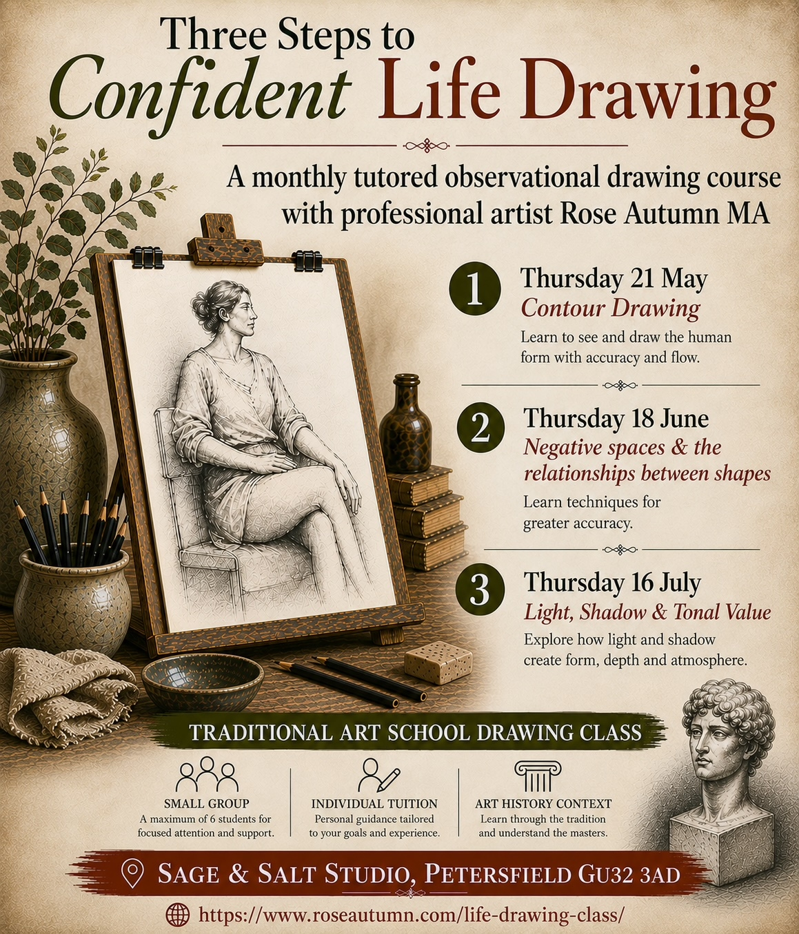
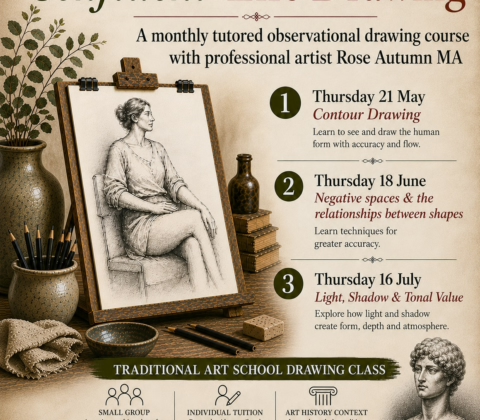
Monthly Tutored Observational Drawing Class
Three Steps to Confident Life Drawing
Monthly Tutored Observational Drawing Class with Petersfield Artist Rose Autumn MA
09:30 to 12:30
Thursday 21 May – Contour Drawing
Thursday 18 June -Proportion & Negative Space
Thursday 16 July – Light, Shadow & Tonal Value
Sage & Salt Studio, 4 Swan Street, Petersfield, Hampshire GU32 3AD
Experience a traditional art school drawing class in a small group with individual practical tuition in an art history context.
Develop confidence in drawing from a live model, with a structured drawing process from line, through proportion, to tonal value.
Across the three classes, you will learn three essential observational drawing skills: finding the edges of the figure, recognising negative spaces and the relationships between shapes, and understanding how the interplay of light and shadow creates form.
You will learn drawing techniques in graphite and charcoal, and how to measure, compare angles, and plot key points around the figure for greater accuracy.
This is a small class limited to eight places for beginners and improvers who want to learn foundational observational skills.
By the end of the course, you will have a practical step-by-step method for approaching the figure with more confidence, accuracy, and clarity.
Please bring
A sketching easel, an A3/A2 drawing board, paper, and clips or an A3/A2 sketchbook if you prefer to sit and work on your lap,
and any putty rubbers and/or erasers that you have.
Graphite pencils, graphite sticks, willow charcoal, compressed charcoal, craft knife, and cloths will be provided.
To book your place, go to: https://www.sageandsaltstudio.co.uk/service-page/three-steps-to-confident-life-drawing
Rose Autumn MA is a Petersfield-based artist and tutor specialising in drawing and painting. She holds a BA and MA in Fine Art from the City & Guilds of London Art School, as well as a teaching qualification. She was formerly a visiting lecturer to undergraduate painting students and has taught amateur artists privately. She has given lectures and demonstrations in drawing and painting to local art groups and schools.
Like my Facebook Page for regular updates: https://www.facebook.com/DrawingWithRose


Art School at Home
British Artist Rose Autumn MA, is a practicing artist who lives and works in Petersfield, East Hampshire. She is offering Art School Tutorials to professional and amateur artists in their homes and studios, either in-person or via Zoom.
Rose is bringing art school quality teaching to the artists of Hampshire with one-to-one private tutoring. If you have artist’s block; are struggling to finish a project; or are looking to move your work forward Rose can gently guide you onto a new course.
With training to Masters level in Art History, Drawing, and Oil Painting she has a deep understanding of her subject combined with teacher training and art school teaching experience. She will offer personalised learning to help build your confidence, develop positive habits, encourage problem-solving skills, and unleash your potential.
Rose will start by reviewing your recent work, research material, and sketchbooks. She will then critique your work, providing feedback on research methods, technique, compositional elements, use of materials, and subject matter. She will advise on further research, art theory, strategies for improvement, setting goals, and offer her creative ideas to progress your projects.
As a trained Tutor and Lecturer in Fine Art with a certificate in teaching adults from Chichester College, she was formerly a visiting lecturer at the City & Guilds of London Art School, where she delivered professional practice seminars and individual tutorials to undergraduate and postgraduate painting students. She now gives tutorials to professional and amateur artists and provides lectures and demonstrations in drawing and painting to local art groups and schools.
Having achieved a First Class BA in Painting and a Distinction in MA Fine Art, she was represented by Long & Ryle Gallery, London and has twenty years of experience as an artist. She was shortlisted for the Jerwood Drawing Prize and has been awarded the drawing prize at the National Open Art Competition, The Brian Sinfield Fine Arts Award at Pastels Today, and the Visitors’ Choice Award at the Brighton Festival Selectors’ Choice exhibition. Drawings were also included in the Manifest International Drawing Annual IV, and Drawing Room II, a survey of contemporary drawing at the Royal West of England Academy. She was an elected Member of the Chelsea Arts Club in London.
With a 2:1 degree in BA (Hons) Business Administration, she has excellent written and oral communication skills. She has written three academic dissertations and was formerly a Public Relations Manager liaising at director level with blue-chip corporations in the Financial and Consumer sectors, writing press and publicity materials for national television and print media.
One-to-one Tutorials via Zoom can be booked online at a rate of £60.00 per hour. Studio visits are £60.00 per hour plus travel costs if the venue is outside Petersfield.
To arrange an informal chat and preliminary meeting please go to the Contact Page.
To book an appointment go to the Bookings Page.