Posts Tagged: traditional viridian pigment
Landscape Painters and Viridian: Why PG18 Matters in Oil Painting
After writing about the change in the Winsor & Newton Artists’ Oil Colour range from traditional Viridian to Viridian Hue, I wanted to look more closely at why Viridian matters in landscape painting.
This is not just a technical question about pigment codes. It is a question about the behaviour of green in painting.
Green is one of the most difficult colour families for landscape painters to control. It can so easily become too bright, too acidic, too decorative, or too illustrative. A good landscape green often has to be broken, softened, greyed, cooled, warmed, or pushed backwards to create a subtle atmosphere. That is where genuine Viridian, made with PG18, becomes important.
In my previous post, I wrote about my disappointment at discovering that the current Winsor & Newton Artists’ Oil Colour Viridian Hue is no longer the same as my old Winsor & Newton Artists’ Oil Colour Viridian 692, AA, Series 4, which I had kept since art school. Winsor & Newton’s current Artists’ Oil Colour Viridian Hue is listed as pigment code PG26 and PG7, not PG18. PG7 is phthalo green, a much stronger and more assertive pigment.
For a landscape painter, that change matters.
What is Viridian?
Viridian is a cool, bluish green pigment. Its pigment code is PG18. Chemically, it is hydrated chromium oxide.
Viridian was first prepared in Paris by Pannetier around 1838, and later patented by the French chemist Guignet in 1859. Because of that, it has also been known historically as Guignet’s Green.
It arrived at an important moment in European painting. The nineteenth century transformed the artist’s palette. New synthetic pigments gave artists colours that were brighter, more stable, more varied, and more reliable than many of the older materials. Viridian belonged to this new world of colour.
Before Viridian, many green pigments were problematic. Some were dull. Some were unstable. Some were poisonous. Emerald green, for example, was vivid but arsenic-based. Viridian offered a more stable, transparent, cool green that could be used in oil, watercolour, and other media.
For landscape painters, this was significant. Viridian was not merely a tube green. It was a modern green that could be used to explore light, air, water, foliage, distance, and shadow.
Why Viridian became important to landscape painters
Viridian is particularly useful in landscape because it is not a loud, opaque, yellowish green. It is cool, transparent to semi-transparent, and slightly blue in character. Viridian Green PG18 is a semi-transparent green pigment with a distinctive blue undertone, found in the paintings of the Impressionists and Post-Impressionists.
That blue undertone is important.
In landscape painting, greens are rarely simple. The green of a nearby leaf is different from the green of a distant tree. The green of grass in sunlight is different from the green of a shadowed bank. The green of a tree against the sky is different from the green reflected in water.
Viridian helps because it can be modified. It can be warmed with yellows, ochres, and earths. It can be neutralised with reds and crimsons. It can be cooled with blues. It can be pushed into greys, blue-greens, sea-greens, and atmospheric shadow colours.
This is why genuine PG18 Viridian is so different from a phthalo-based Viridian Hue. A phthalo green mixture may look similar from the tube, but it often has a much stronger tinting strength. It can take over a mixture very quickly. That may be useful in some kinds of painting, but it is not always helpful in naturalistic landscape painting, where subtle control is everything.
Viridian and the Impressionists
Viridian became closely associated with the Impressionists and Post-Impressionists. This is not surprising because their work depended on outdoor observation, broken colour, optical vibration, and a much more direct engagement with modern pigments.
The Impressionists were not simply painting “green fields”. They were painting the effect of light on green. They were painting air, weather, reflection, distance, and changing conditions.
A pigment like Viridian gave them a cool green that could be used in mixtures and contrasts. It could be set against warmer colours, and it could assist in building the optical complexity of foliage, water, and shadow.
Viridian’s importance is not that every Impressionist used it in exactly the same way. Its importance is that it belonged to the modern palette that made this new approach to landscape possible.
Claude Monet and modern green
Claude Monet is one of the painters most closely associated with the modern landscape palette. His work depends on the relationship between colour, light, water, reflection, and atmosphere.
Viridian belongs naturally to this world. A cool, transparent green is useful in painting water, reflected trees, shadowed banks, and the cooler notes in foliage. Viridian and chromium oxide greens entered painting at a time when plein-air landscape painting was becoming increasingly important.
Monet’s use of greens was never simply descriptive. He was not just filling in trees or grass. He was building a colour structure. In that kind of painting, a green pigment has to be capable of subtle relationships. It has to work with blues, violets, yellows, reds, and earth colours. It has to sit within the whole atmospheric key of the painting.
That is why genuine Viridian is so useful. It is not merely bright. It is adjustable.
Van Gogh and Viridian
Vincent van Gogh also used Viridian. In his case, the pigment becomes part of a more expressive and structural use of colour.
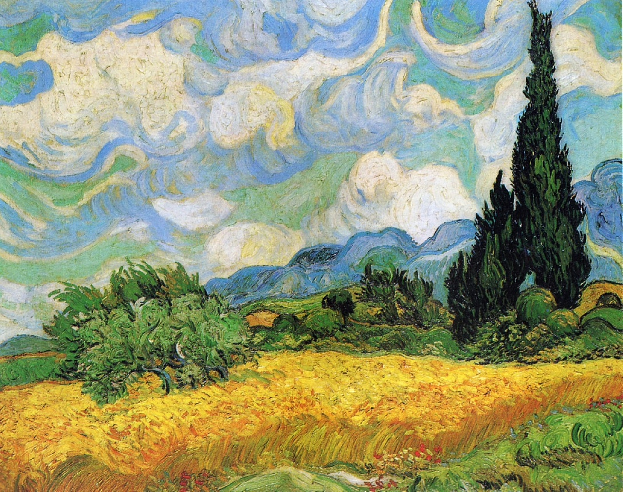
Viridian can be identified in Van Gogh’s A Wheatfield with Cypresses. In one area of the painting, the pale green bush below the blue mountain is described as containing Viridian, chrome yellow, and zinc white. Other green passages contain mixtures involving emerald green, hydrated chromium oxide green, zinc white, and chrome yellow.
That example is useful because Van Gogh was not using green timidly. He was using modern pigments to create force, rhythm, heat, structure, and emotion. The National Gallery describes A Wheatfield, with Cypresses as one of several versions Van Gogh painted in 1889 while he was at Saint-Rémy.
Viridian, in Van Gogh’s hands, is not merely naturalistic. It becomes part of a heightened landscape language. It can contribute to the intensity of the painting while still retaining its cool, bluish character.
This shows one of the great strengths of Viridian. It can be used subtly, but it can also be used expressively. It is not a weak pigment. It is a controlled pigment.
Viridian and the problem of distant trees
One of the reasons I became interested in Viridian again was because I am now working with landscape after twenty years of working almost entirely in charcoal. In charcoal, tone, edge, pressure, and atmosphere are everything. Returning to oil paint, I am very aware that colour can easily become too literal, which is particularly true when painting trees in the distance.
Distant trees are not usually bright local green. They are affected by air, light, moisture, and distance. They often need to be cooler, greyer, softer, and less saturated than the trees in the foreground. A strong phthalo-based green can easily come forward. It can sit on the surface of the painting rather than receding into space.
Genuine PG18 Viridian is useful because it can be persuaded into distance. Mixed with earthy reds and ochres, it can produce broken greens that feel more natural and less artificial. It can help create a green that belongs to the landscape rather than sitting on top of it.
That is why I think the move from PG18 to PG26 and PG7 in the Winsor & Newton Artists’ Oil Colour Viridian Hue is a real issue for landscape painters because it changes the way the colour behaves.
Why PG18 is different from PG7 in practice
PG18 Viridian is generally quieter, cooler, more transparent, and more subtle. It has a restrained tinting strength. It can be used in glazes and in delicate mixtures. It is very useful when a painter wants natural greens without garishness.
PG7, phthalo green, is a very different pigment. It is powerful, staining, highly tinting, and intensely chromatic. It is an excellent pigment in its own right, but it does not behave like traditional Viridian.
The problem with a Viridian Hue containing PG7 is not that it is unusable. The problem is that it is not a direct replacement. It may look close enough in a colour chart, but it will not necessarily mix like PG18 on the palette or behave like PG18 in a painting.
For serious painters, pigment behaviour matters more than colour name.
English landscape painting and restrained green
As someone particularly interested in English landscape painting, I think this question of restraint is important.
English landscape painting has often depended on subtle tonal and atmospheric relationships. Whether one is thinking about Constable’s broken naturalism, Turner’s atmosphere and light, the tonal restraint of later landscape traditions, or the painterly handling of twentieth-century British landscape painters, green is rarely just green.
The English landscape is full of muted colour: damp fields, grey skies, winter hedges, blue-green distance, dark tree masses, chalk paths, wet leaves, and low light. A landscape painter needs greens that can be moderated.
Viridian is useful because it can help produce these cooler, quieter notes. It is especially valuable when mixed away from its full chromatic strength. It can be taken into greys, soft blue-greens, shadow greens, and atmospheric mixtures.
This is the opposite of the crude “grass green” problem that ruins so many amateur landscapes. The aim is not to find the brightest green. The aim is to find the right green in relation to the whole painting.
Why I am replacing my old Winsor & Newton Viridian with Rembrandt 616
My old Winsor & Newton Artists’ Oil Colour Viridian 692 is now something I will use sparingly. It appears to belong to the older PG18 formulation. The current Winsor & Newton Artists’ Oil Colour Viridian Hue 696 is listed as PG26 and PG7.
That makes me reluctant to buy it as a replacement.
Instead, I am going to try Rembrandt Oil Colour Viridian 616. Royal Talens lists Rembrandt Viridian 616 as PG18, semi-transparent, with its highest lightfastness rating. It also appears to be one of the best-value genuine PG18 Viridian paints currently available in a large tube.
For my purposes, that makes sense. I want a genuine Viridian for landscape painting: a cool, transparent, restrained green that can be used in mixtures, glazes, distant trees, shadowed foliage, and atmospheric passages.
I do not want a phthalo-based approximation when the whole point is subtlety.
Other artist-quality PG18 Viridian options
For artists looking for genuine Viridian, the key is to check the pigment code. Do not rely only on the colour name. Look for PG18. Some artist-quality oil paint manufacturers that produce or have produced genuine PG18 Viridian include:
Rembrandt Oil Colour Viridian 616
Gamblin Artist Oil Viridian
Jackson’s Professional Oil Viridian Green
Michael Harding Viridian
Old Holland Viridian Green Deep
Williamsburg Viridian
Holbein Viridian
M. Graham Viridian
Blockx Viridian
Lefranc Bourgeois Viridian
Maimeri Viridian
Cranfield Viridian Green
Rublev/Natural Pigments Viridian
Availability changes, so I would always check the current pigment information before buying. Paint names are not enough. The pigment code is the important part.
Conclusion: Viridian is not just a green
Viridian has a serious place in the history of landscape painting. It belongs to the nineteenth-century expansion of the artist’s palette, to the rise of modern plein-air painting, and to the colour language of Impressionist and Post-Impressionist landscape.
It is useful because it is subtle. It is cool, transparent, bluish, and capable of being modified into natural greens. It can help a landscape painter avoid crude, illustrative colour.
That is why the change from traditional PG18 Viridian to a PG26 and PG7 Viridian Hue matters. For some painters, the hue may be perfectly acceptable. But for artists who care about pigment behaviour, especially in landscape painting, it is not the same thing.
For serious landscape painters, the advice is simple: check the pigment code. If you want traditional Viridian, look for PG18.
That is what I am doing now. My old Winsor & Newton Viridian has reminded me what a useful pigment genuine Viridian can be. My next step is to test Rembrandt Oil Colour Viridian 616 and see how closely it performs as an affordable replacement in my own landscape painting.